Instrument & Deal Ticket
Upgrade.
Instrument and deal ticket management are critical to a trading platform's success. However, existing UX friction points were preventing users from fully realising the platform's potential. This project was initiated as a comprehensive, multi-stage discovery process to deeply understand the current state and identify opportunities for meaningful improvement.
Problem definition & approach.
The platform's deal ticket and instrument management experience had accumulated significant usability debt. Users faced barriers at nearly every stage of the trading journey — from discovering instruments to placing and confirming orders. Internal feedback and cross-team collaboration surfaced the need for a structured, evidence-based redesign approach.
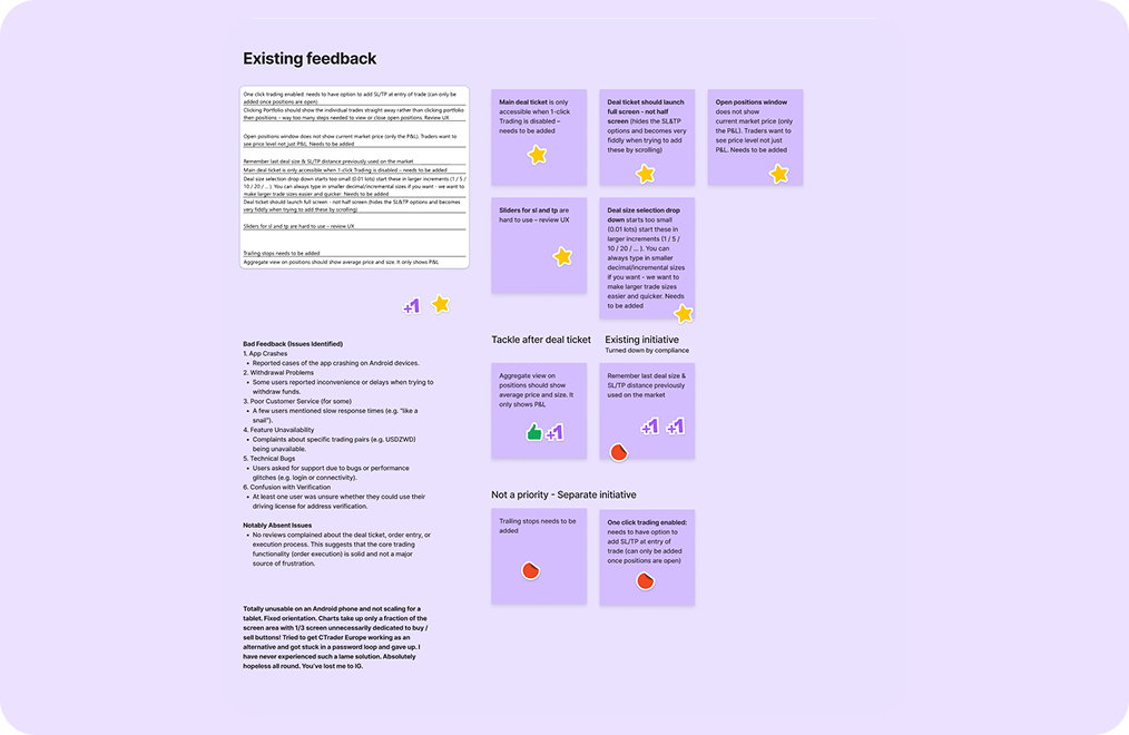
01 — Feedback gathered across channels
An analysis of the home screen and key surfaces was carried out to identify usability gaps. This included consolidating feedback from 93 participants through surveys and cross-team collaboration with internal domain experts to capture both user-facing and business-facing pain points.
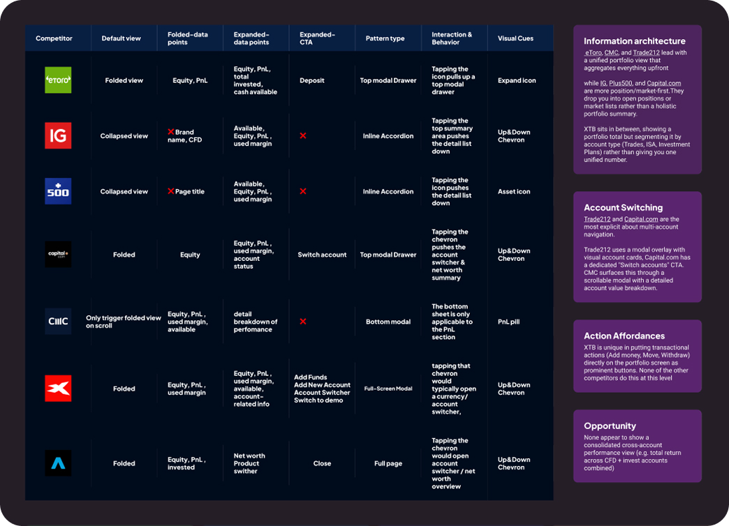
02 — Benchmarking core CFD competitors
A review of core CFD competitors was conducted to benchmark strengths and weaknesses across the industry and identify what a best-in-class trading UX looks like. This informed both the design direction and feature prioritisation.
eToro, IG, Plus500, Capital.com, CMC, XTB and Trading 212 were audited across default view, data density, expanded CTAs, pattern type and interaction behaviour.
03 — Journey Mapping
Core user flows were mapped across three stages — pre, during and post-engagement — to expose friction across the end-to-end experience.
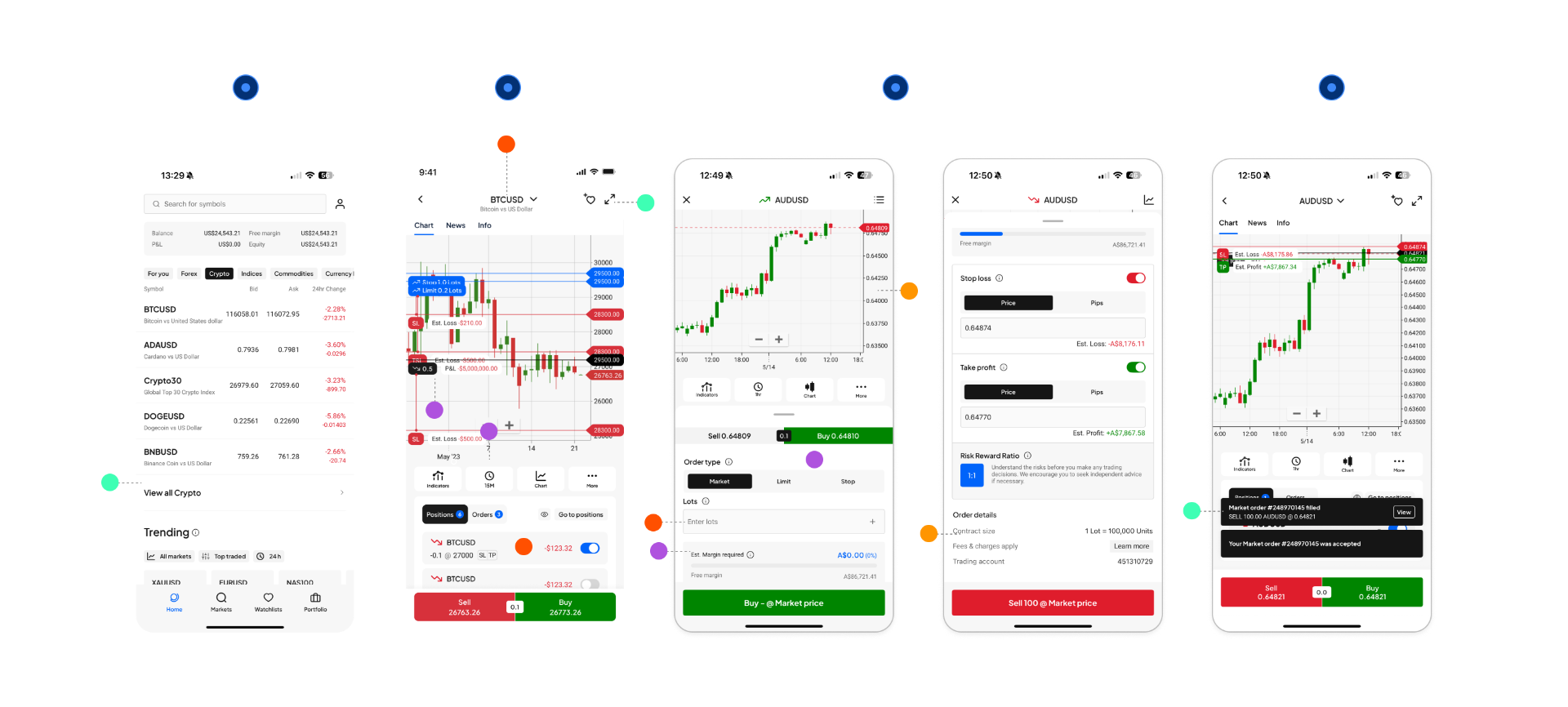
The research converged on four critical problem areas.
- Deal ticket is only accessible when 1-click Trading is disabled. Not flexible for users access from other entry
- Entry to one-clicked trade is not prominence that easy recognize to users
- Confirm the order and redirect the user to the instrument page, breaking away from the current context
- Unclear market status & overall symbol performance
- Open positions show only P&L, not current market price — traders need the price level
- No fractional lot size guidance (min/max not surfaced)
- Order details buried below the fold — easy to miss without scrolling
- Deal ticket launches half-screen, hiding SL&TP options and forcing awkward scrolling to set them
- Trade size input doesn't accommodate very large or very small sizes
- Timeframe switcher absent from the ticket — traders have to leave the ticket to change it
- No GTC / Day / IOC order expiry duration options
- Chart and order form feel disconnected — no way to drag TP/SL lines visually on the chart
Transparent · Informative · Simplified.
The overhaul was guided by a single UX/UI principle — Transparent · Informative · Simplified — to improve overall usability by reducing data density and clarifying information hierarchy, so that key trading actions feel grouped and contextual rather than scattered across the interface.
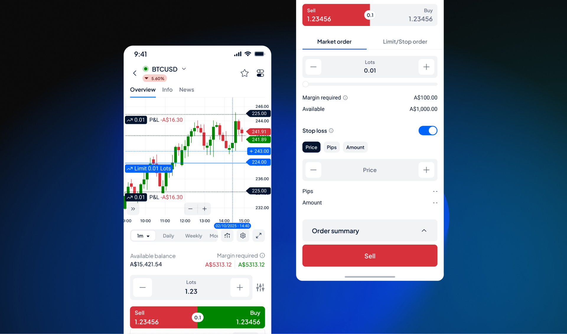
What we've changed
Relevant information are grouped together for users to focus on key info & primary actions needed
- 2-tab order type (Market / Limit+Stop) vs 3-segment toggle
- Collapsible Order Summary keeps the form scannable
- UXW simplified rather than repeating order details already visible on screen
Reduce color usage and visual clutter, and data density
- Generous whitespace between sections replaces hard dividers
- Lighter overall density makes the critical action (the Sell button) easier to reach visually
Increase information transparency to users by giving the right context
- Third SL input mode (Amount) added alongside Price and Pips
- −/+ steppers, and swipe sheet on price input for fine-tuned adjustments without the keyboard
Increase how information is communicated in a clear way
- Margin required and Available shown as clean label/value pairs
- Removes the progress bar and percentage breakdown — less data, faster to parse at the moment of placing a trade
What's Next.
Data collection is ongoing following the initial launch. A post-launch review is planned to evaluate whether the redesign has meaningfully moved the needle on friction reduction and trading confidence. Findings will inform the next iteration of the experience.