CFD Deposit Experience
Redesign.
Re-thought deposit around the high-value cohort — regional payment preferences, a 3-day cross-functional workshop, and a future flow that reduces drop-off from first deposit to funding.
Deposits are concentrated, habitual, and high-stakes for the right few.
In payments — especially in high-risk industries — customers need the payment processor to facilitate deposits with confidence. This project set out to understand the current deposit experience, identify where friction existed, and redesign the flow to reduce failure and increase trust at every step. Through customer data, it surfaced a layered set of trust, clarity and speed issues — each compounding across user segments and regions.
0.1Customer data observation across the deposit journey
- Of clients who start the journey, only 24% make a first deposit — with APAC at 26% and LATAM at 27%.
- Of clients who committed to the 1st deposit, the majority 72% deposit under AUD 1,000.
- 69% of the users who made a 1st deposit come from repeat depositors, averaging every 22 days.
- 2.3% of customers account for 95% of MNR and 75% of ongoing deposits. High-value personas collectively drive 84% of ongoing deposits.
- There's no native payment capability, however we observe 77% of deposits happen on mobile H5 vs 22% desktop.
- For clients facing margin calls, deposit speed directly prevents stop-outs — latency here has real financial consequences.
0.2Payment preferences are consistent — but regionally distinct.
Ubiquitous across every tested region.
- The baseline expectation for first-time depositors regardless of geography.
The most consistent method, everywhere.
- The least resistant to change, but carries usability debt in instruction sequencing and status feedback.
M-Pesa at 88% for first deposits.
- The only region where local methods out-perform the global standard — requiring tailored treatment.
Credit cards are ubiquitous. Local payment methods define the exceptions. Among all tested regions, Africa is the clear outlier — M-Pesa reaches 88% for first deposits, making it the only region where local methods out-perform the global standard. Bank transfer is the most consistent method everywhere, and the least resistant to change.
0.3Look into the current web deposit flow
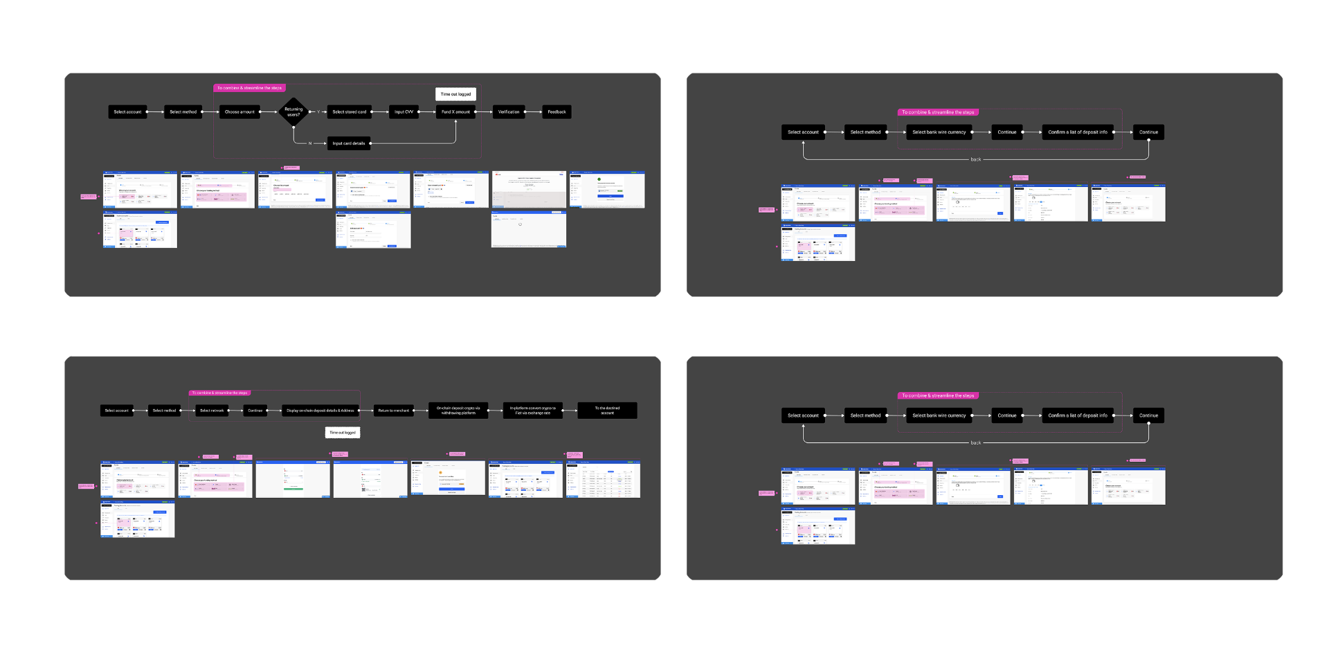
The current payment journey was mapped through a payment categories framework — Credit Card Flow and Bank Transfer — to understand how users move through the experience.
- 1Ease of Use
- 2Navigation
- 3Transaction process
- 4Clarity of Instruction
- 5Responsiveness
- 6Performance and Speed
- 7Error Handling
- 8Accessibility Considerations
- 9Customer Support and Resources
- 10User Feedback Collection
- 1Fees, policies and conditions are unclear
Users don't understand how transactions work, what risks are involved, or what to expect — leading to hesitation and drop-off before completing a deposit.
- 2Users don't know how the platform works
Lack of educational support means users hit confusion during the flow with no way to self-serve — driving repeated support queries and abandonment.
- 3No feedback during or after actions
Users are left in the dark about whether their transaction is progressing, succeeded, or failed — creating anxiety and eroding trust in the platform.
- 4Interface is too complex and visually noisy
Too much information competing for attention pulls users away from the task at hand — increasing cognitive load and slowing down completion.
- 5Information hierarchy doesn't match user priorities
Key steps and decisions are buried under supplementary information — users struggle to identify what matters most at each stage of the flow.
- 6Too many steps to complete a deposit
The flow is fragmented across multiple screens unnecessarily — increasing time-to-complete and creating more opportunities for users to drop off before funding.
3-full day workshop to align plan, goal, success metric & priority.
Following research, the team ran a 3-day workshop to align on the redesign upgrade of Payments — including an audit of the technology hub with 10 developers to set up the technology stack.
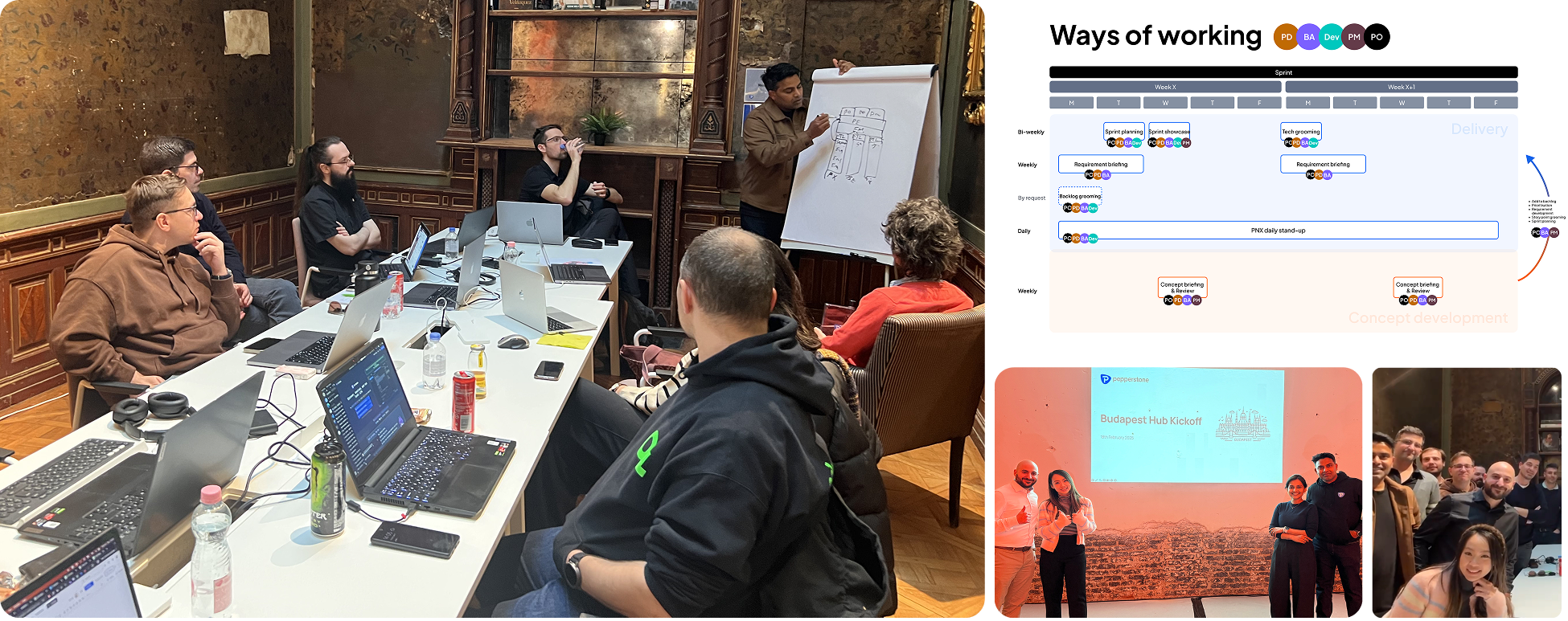
What we achieved in 3 days
- Core jobs-to-be-done mapped across the deposit journey.
- Defined scope for the first module — ready to hand to engineering.
- Cross-functional team aligned on priorities and sequencing.
- Hours of working in collaborative tools — every decision traceable.
Trackers & success metrics defined
The percentage of visitors who complete a deposit = Number of completed deposits / Number of visitors.
Users who trigger multiple transaction attempts in one session.
Number of users who change method after selecting one.
Number of users who successfully submit a deposit attempt — specifically for 1st time deposit.
Key UX insights to increase customer trust.
Synthesising pain points across customer data and UX heuristic analysis, we identified four design principles to guide the enhancement — and re-imagined the deposit experience around them. The redesign focused on three core upgrades to the deposit experience — simplifying the entry, prioritising mobile, and optimising for the repeat depositor cohort.
- Clearly communicate fees, policies and conditions. Provide detailed information about how transactions work, reminders, and any potential risks involved.
- Provide educational resources that help users understand the platform — tutorials, webinars, and a comprehensive FAQ section.
- Communicate with users about their actions and the results of those actions, and collect feedback to guide ongoing improvements.
- Maintain a consistent interface and experience across platforms to build familiarity and trust in the brand.
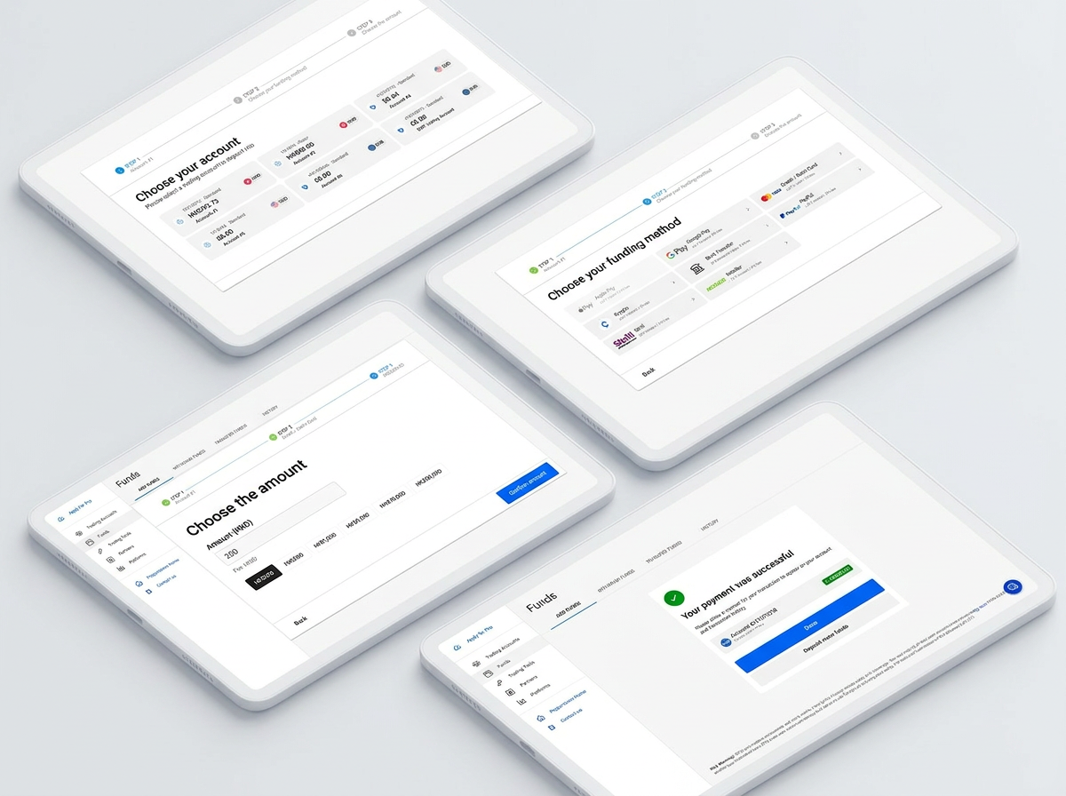
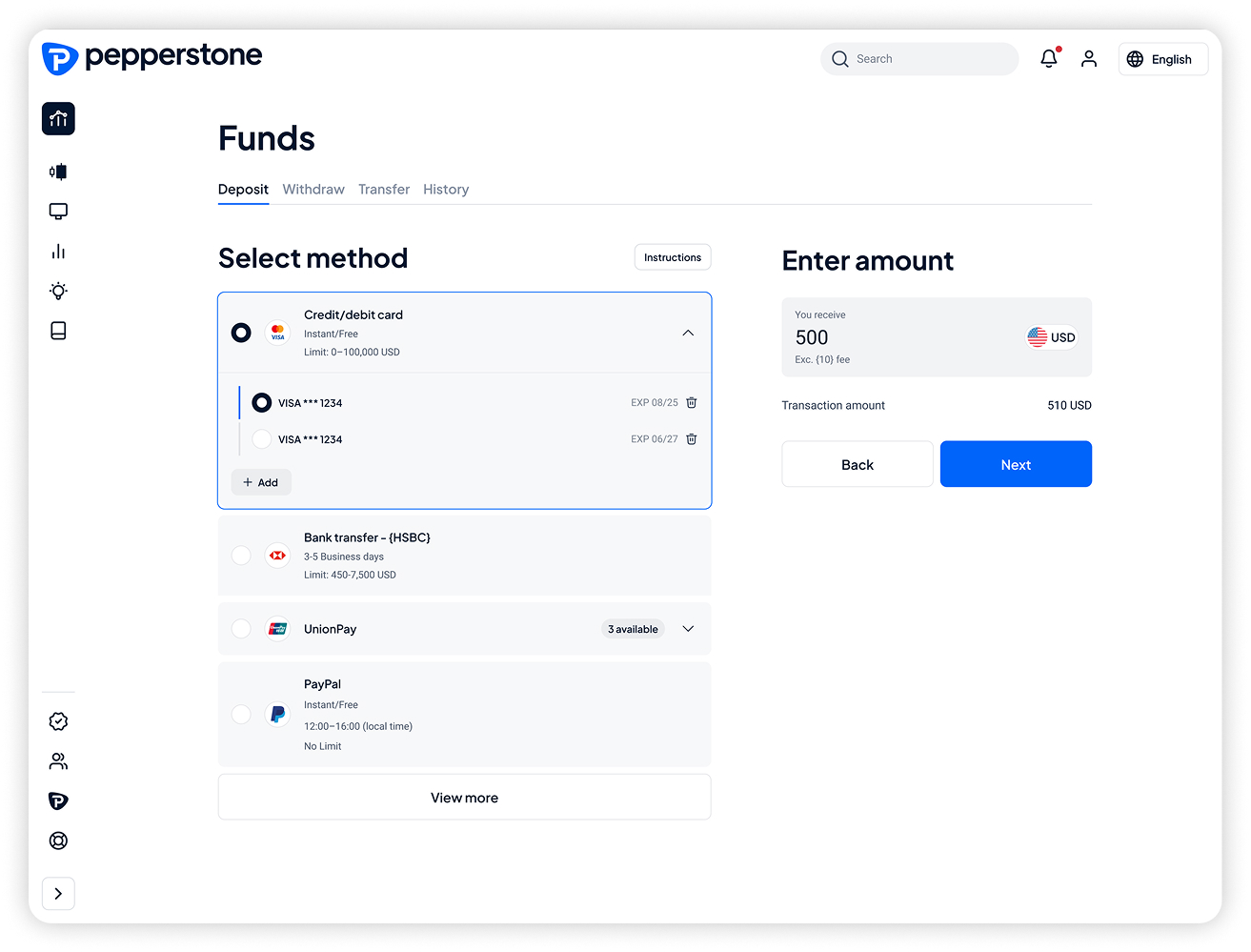
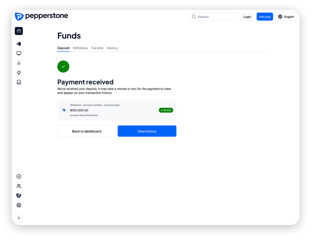
01. User flow streamline (Example with credit card flow)
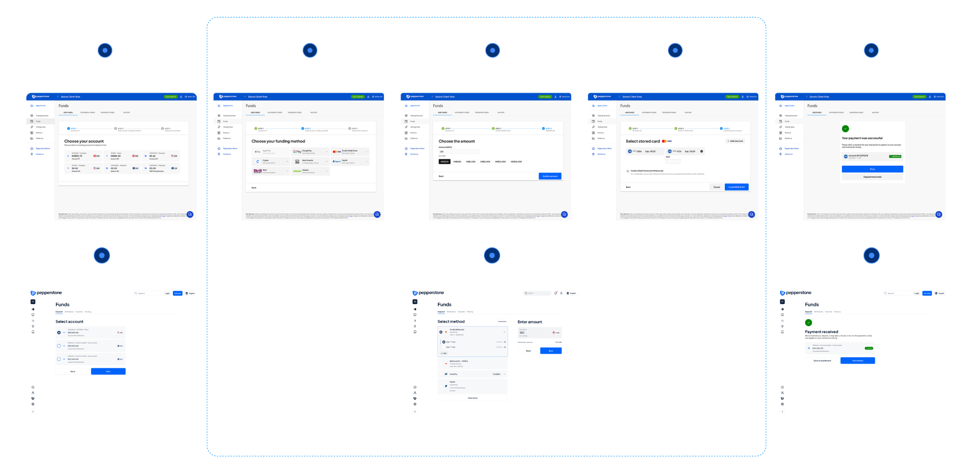
02. Information architecture & interface redesign
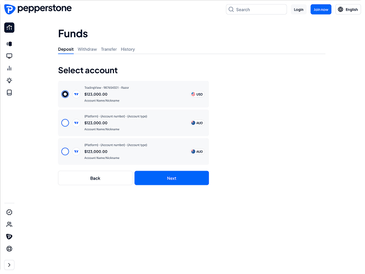
What's new
- Removed redundant and low value information to reduce cognitive load and improve user focus
- Proactively surface relevant account details that users care about. (E.g. platform name, account type)
What's new
- User guide: Information tooltip to guide users about how deposit works across payment methods & process
- Payment info: Sets accurate expectations by providing visibility on payment method information (e.g. limit, transaction fee)
- Method & Fee comparison: Side by side comparison across payment method to give immediate context for payment method selection (E.g. transaction fee charged, conversion rate)
- Input field & error handling: Clearly indicate minimum and maximum allowed range in the input field to set expectation.
- Localisation & Overflowing friendly: Adjust interface and UI components to ensure edge cases are addressed for localisation
What's new
- Manage expectation: Provide accurate time of arrival to build on trust and transparency. Better manage user's expectation ahead
- Primary CTAs to suggest the next logical step as the guided path to drive conversion
Testing & continued iteration.
The redesigned deposit experience is entering a testing phase: usability testing with first-time and repeat depositors across key regions, A/B testing on critical decision points (method selection, confirmation screens), regional validation — particularly for Africa where local method dominance requires tailored treatment — and metric tracking against the defined success framework.
The work validated that deposit friction is not one problem — it is a layered set of trust, clarity and speed issues that compound across user segments and regions. The redesign addresses each layer with targeted interventions grounded in research.