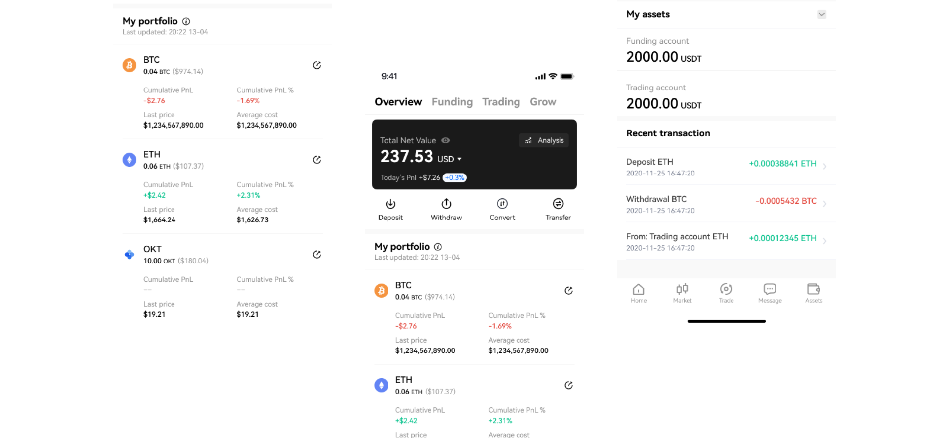
Asset overview revamp
A three-month project collaborated across functions (Asset, Trading, Financial Product, User research, and Engineers) to simplify the current Asset overview (Phase 1) with better portfolio visualization and PnL tracking experience for all OKX users, ensuring simplicity and ease of use.
The lowest-scoring module on the most-visited page.
In October 2022, a satisfaction survey was run across the Asset team to evaluate user experience with each key Asset function. The results were unambiguous — the Asset Overview page scored 4.28/5 on CSAT, the lowest performing module across the platform. Internal feedback from colleagues within OKX further confirmed recurring usability issues that were going unaddressed.
As the most visited page in the Asset module, improvements here carry the highest reach and impact of any single design investment. The team set a clear target: increase CSAT to at least 4.5/5 through a focused design revamp.
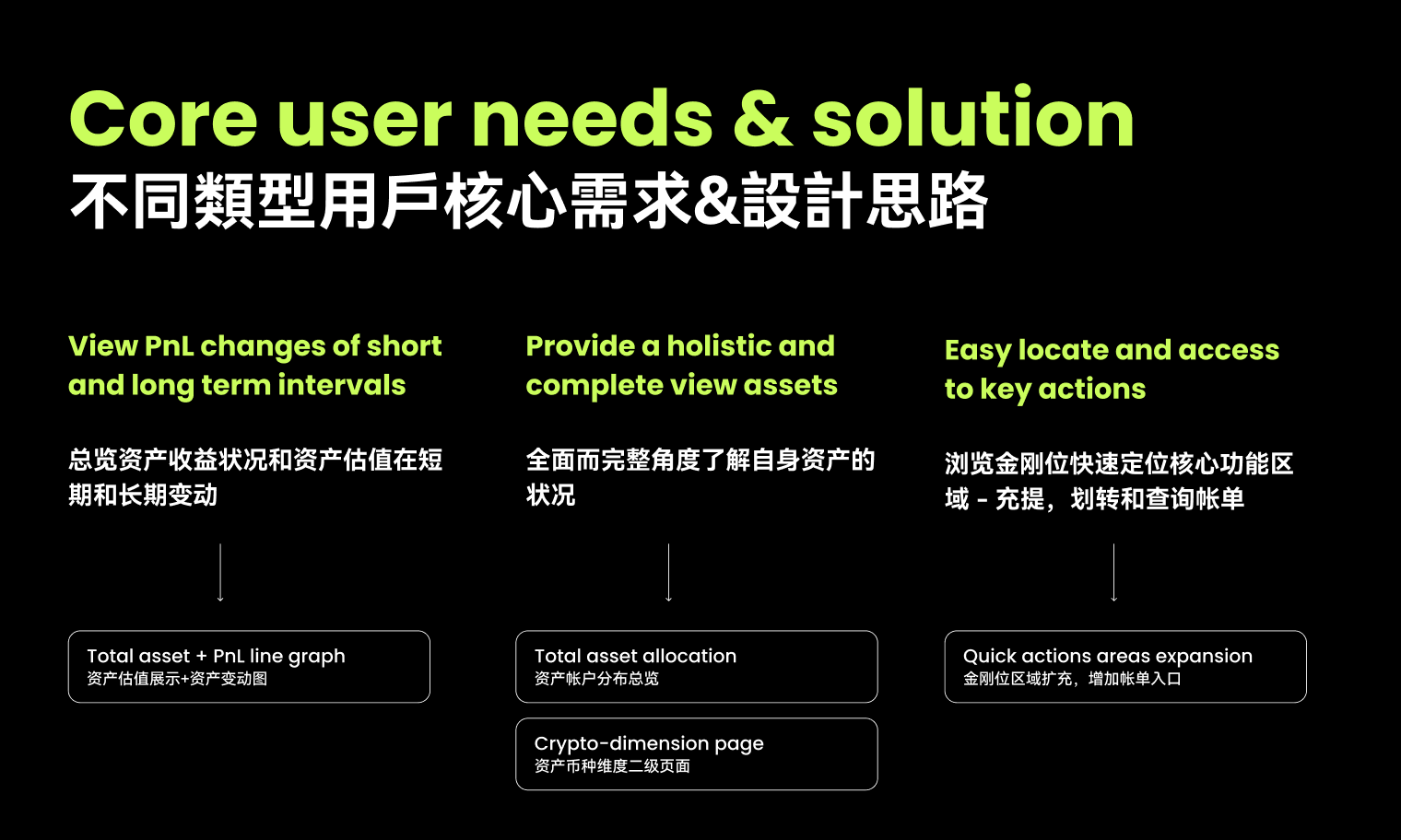
Two design tensions shaped the entire project from the outset.
Two design tensions shaped the entire project.
The overview needs to meet the portfolio management needs of casual holders while also fulfilling the more specific, data-intensive requirements of advanced traders — without overloading either group.
The Asset Overview is a gateway that connects to multiple business lines across OKX. Keeping the revamp in sync and aligned across all key stakeholders — on time — required as much coordination as it did design.
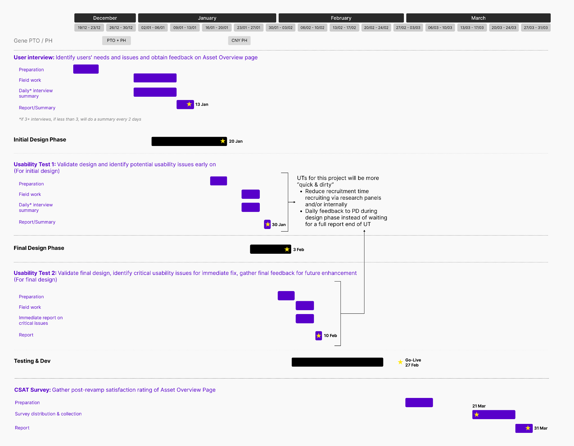
Research ran continuously, not as a single upfront phase.
Given the critical role the Asset Overview plays in the user experience, research was conducted continuously throughout the revamp rather than as a single upfront phase.
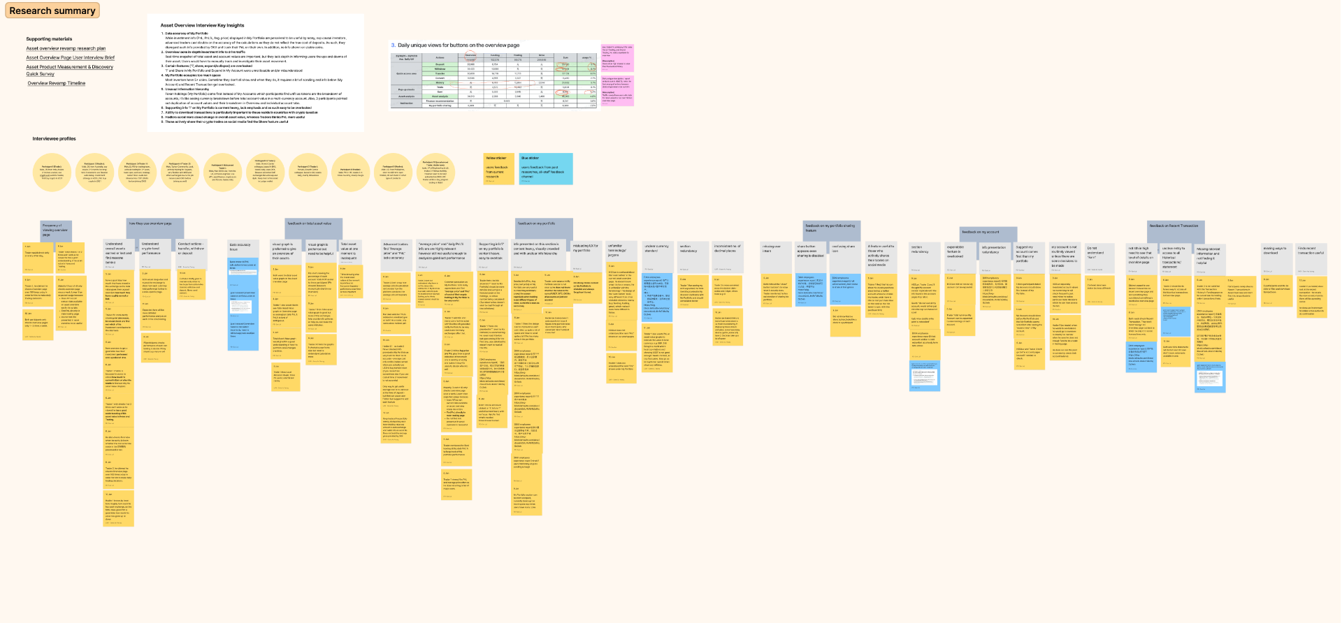
User Research & Usability Testing
Designed key user flows and clickable prototypes tested with 10 target users — split across Traders and Holders — to surface needs, validate assumptions, and identify friction early.
Co-creation Workshop
Conducted ideation workshops with cross-functional stakeholders to derive qualitative and quantitative insights, resulting in 20+ product enhancement opportunities identified across Asset account-level pages.
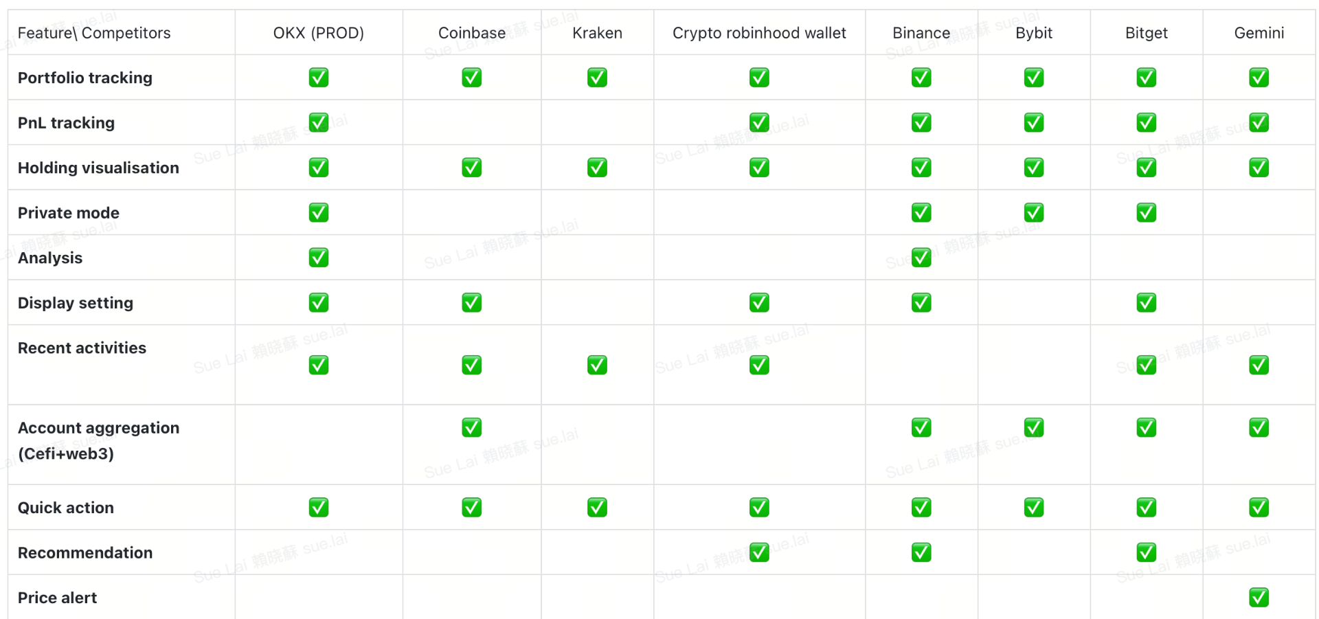
Competitive Analysis
Audited the top 10 direct exchange competitors to establish a solid market baseline — comparing features, navigation flow, and information architecture across the category.
Close the gap between what users need and what they see.
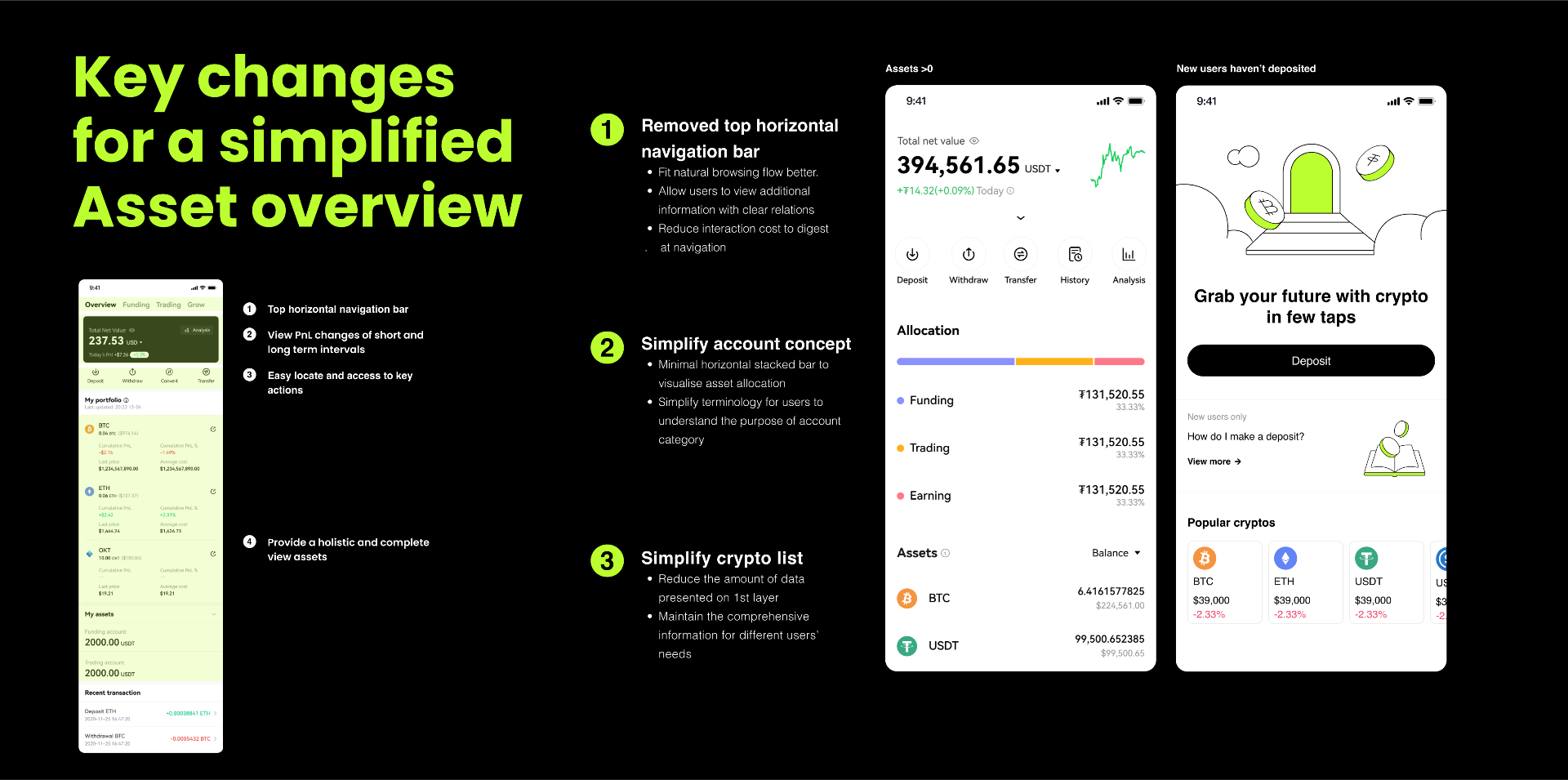
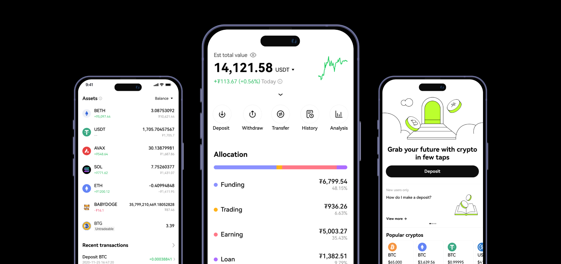
The design phase was guided by a single principle — close the gap between what users need to see and what the current experience actually shows them. Six features were scoped and delivered as the agreed Phase 1 release, supported by a comprehensive set of wireframes and clickable prototypes to communicate and validate design decisions with stakeholders.
Eight rounds of design QA were initiated across the delivery cycle, with 93 documented issues resolved before handoff — ensuring the experience met the quality bar required for full release.
Measurable impact on the two primary metrics.
The redesign delivered measurable impact across the two primary success metrics:
- ↗ +18% increase in first deposits
- ↗ +24% increase in daily active users on the Assets tab