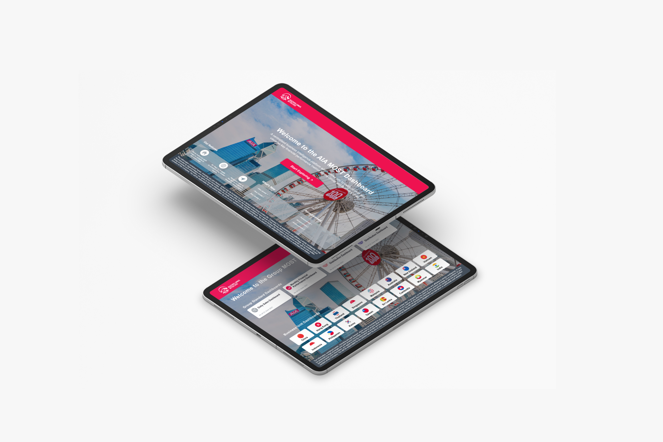
AIA MOST.
Management One Source of Truth.
A BI analytics tool that collapses 1,300+ Excel and PowerPoint trackers into a single, real-time management reporting surface for the AIA group finance team — shipped as an MVP in two sprints.
1,300+ trackers, zero shared view.
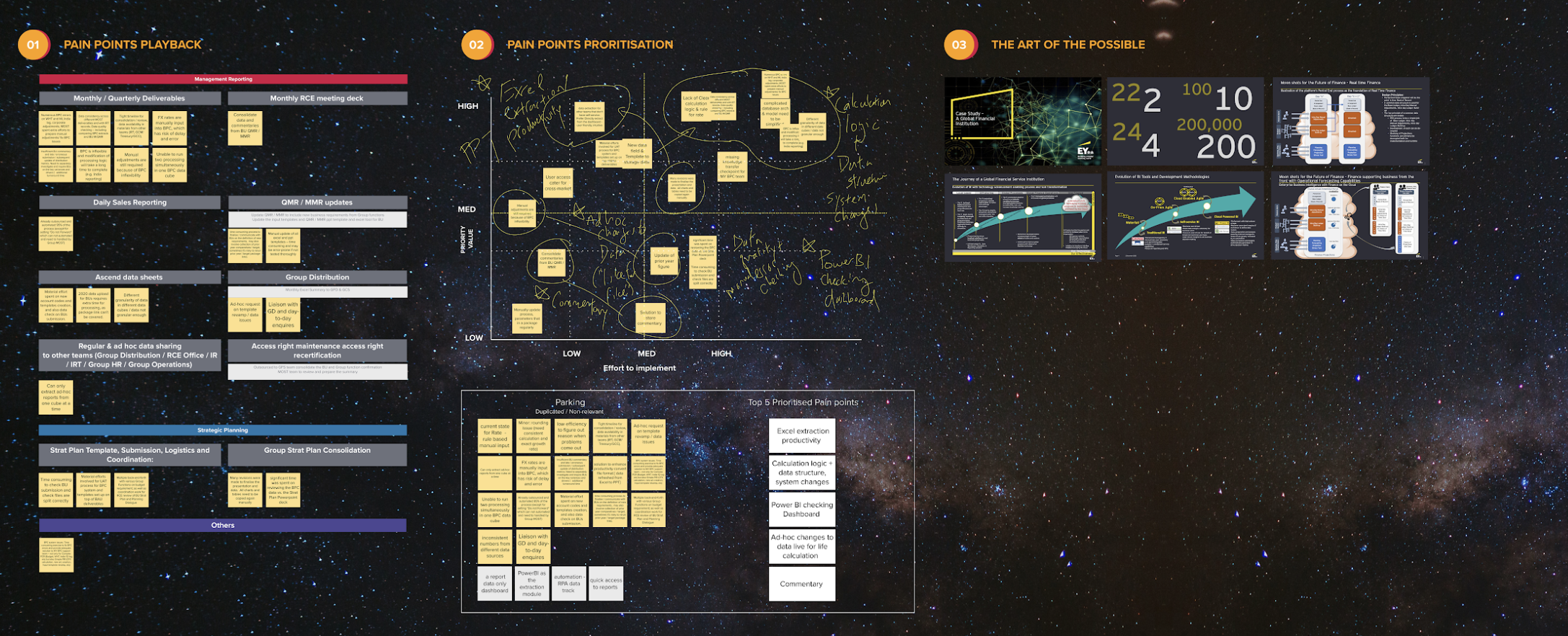
The client — AIA's group finance team — wanted a data-driven, transformational BI solution to advance tracking across systems and projects. More than 1,300 systems and situations were tracked through Excel and PowerPoint, with constant back-and-forth to distribute, collect and clarify across reporting lines.
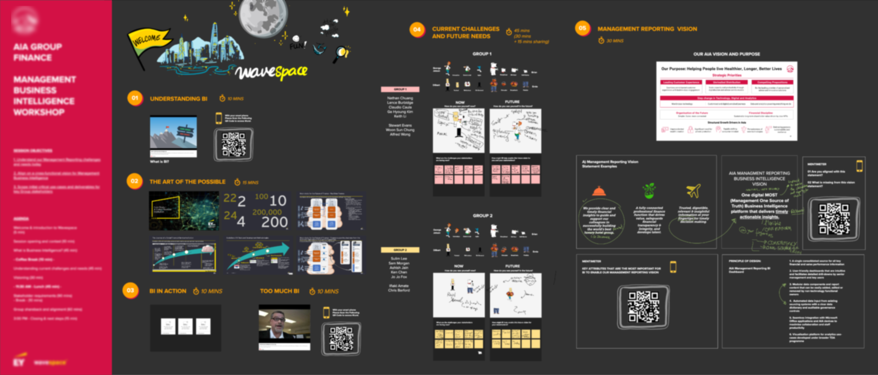
Driven by the business vision of MOST · Management One Source of Truth, the management consulting team brought EY Wavespace service design into the preliminary scoping conversation.
"Analytica" was slow, fragmented and impossible to scale.
A self-service reporting capability for corporates that relied on data from multiple APAC countries — yet lacked any consolidated cross-market view.
Reports took up to 30 seconds to render, producing poor UX and weak adoption among the corporate users it was meant to serve.
The legacy solution wasn't scalable and wasn't portable to the Cloud — out of step with the group's wider cloud strategy.
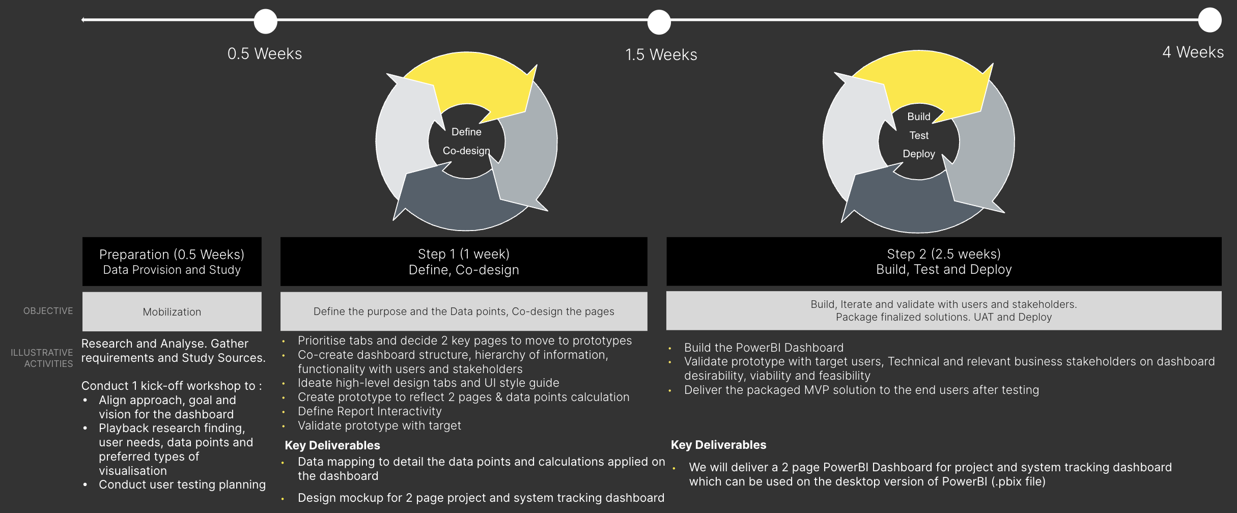
Design thinking folded into agile delivery.
We leveraged design-thinking phases inside an agile delivery cadence — a four-week sprint pattern to take any new dashboard from Define / Prioritise → Co-design → Build → Test & Deploy.
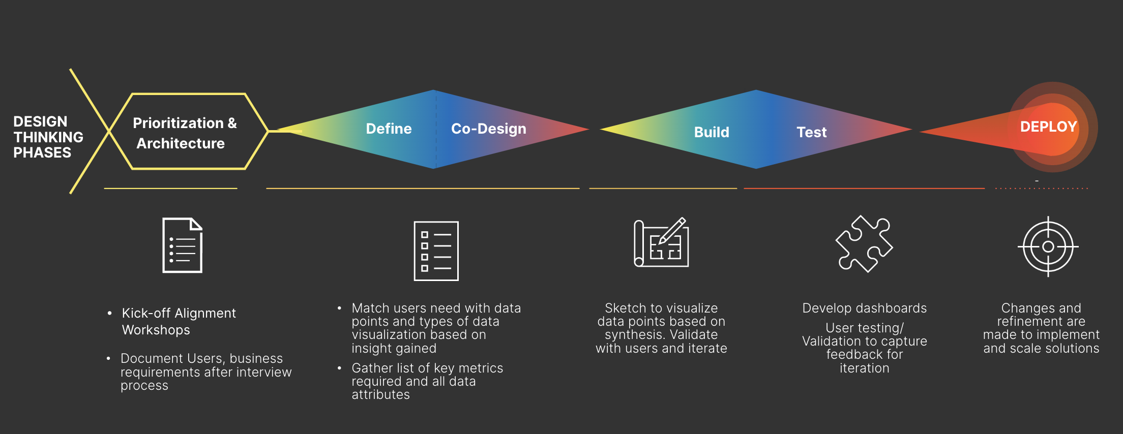
Start with the "why", not the chart type.
We deep-dived into the why — making sure the MVP was driven by user needs and motivations rather than aesthetics or trends. Exploratory workshops and stakeholder alignment surfaced the shared management-reporting vision across functions.
Every data point traced to a calculation, a purpose and a place.
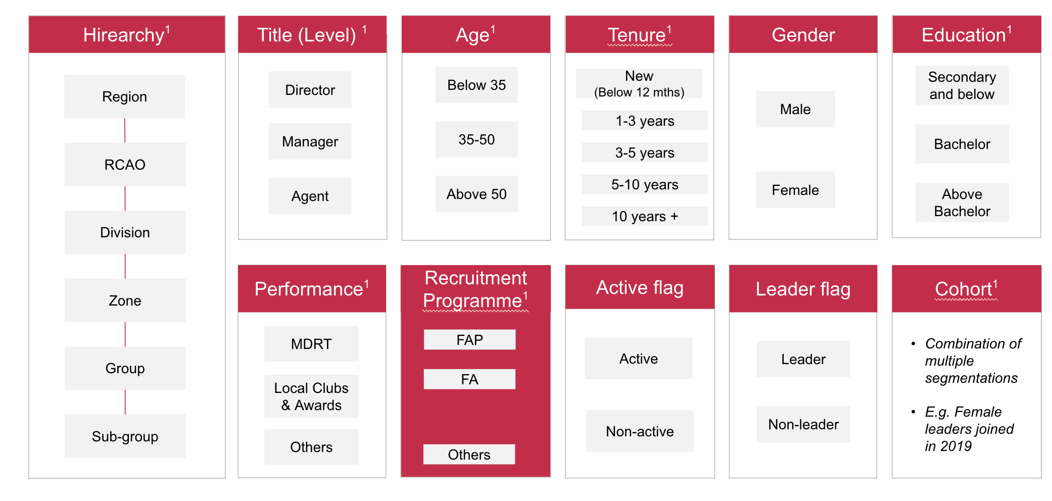
Worked closely with data analysts to map out every data point and its calculation. Through categorisation we defined the purpose, data points and layout structure of all requested dashboards.
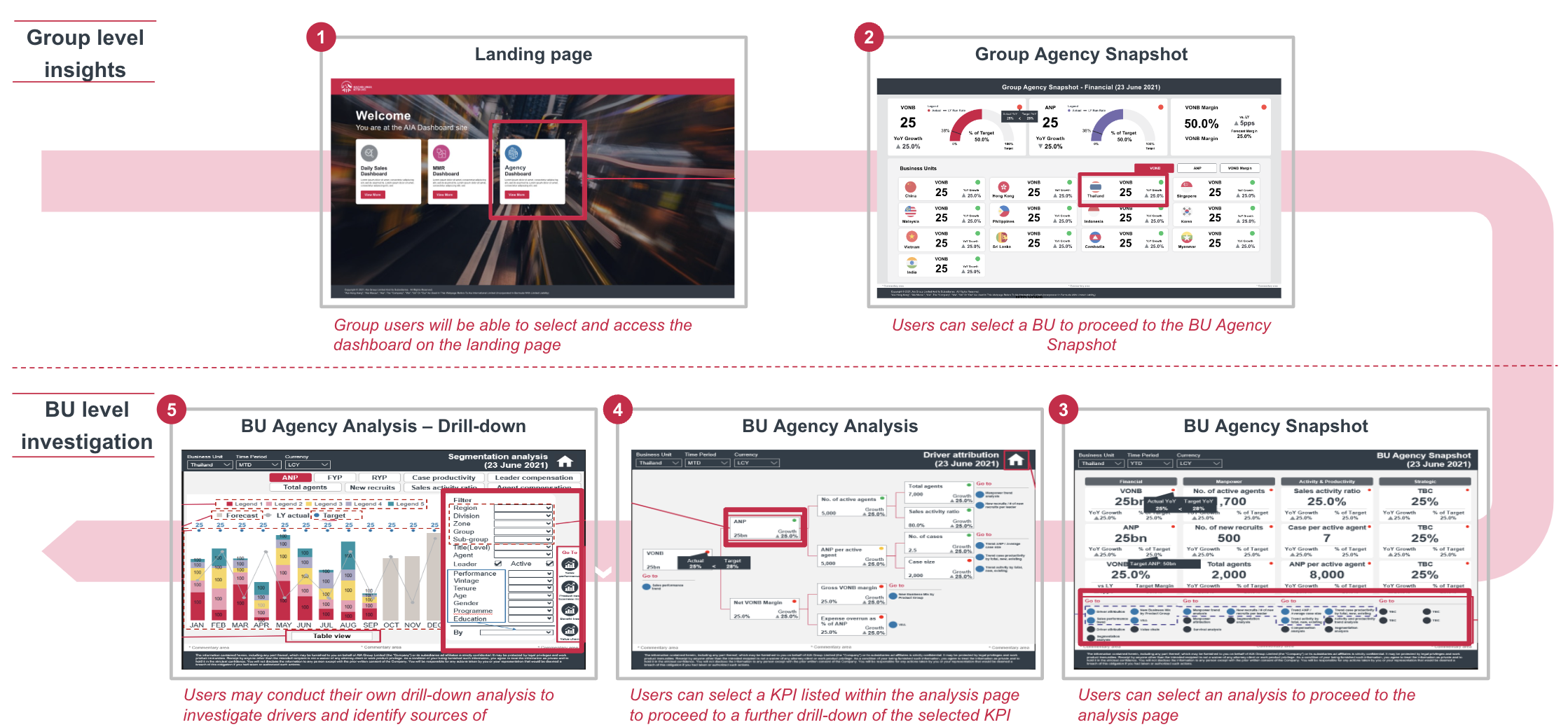
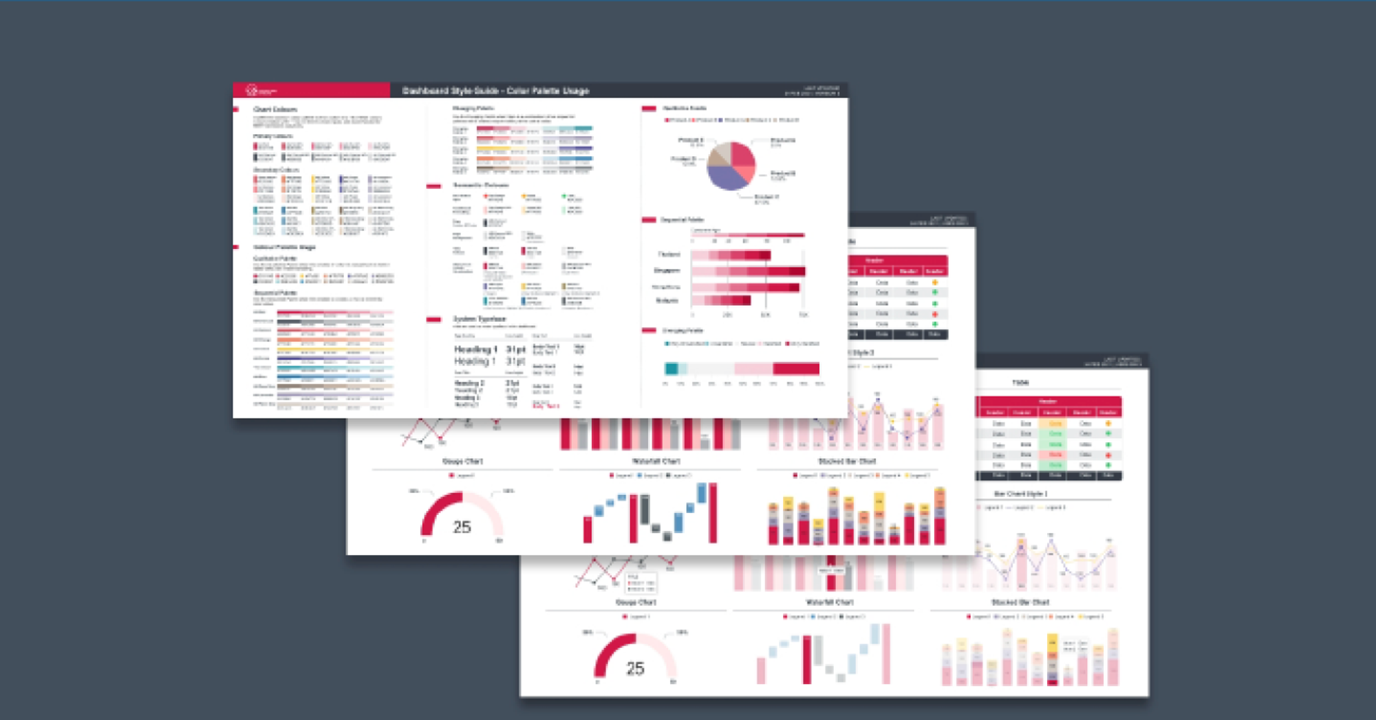
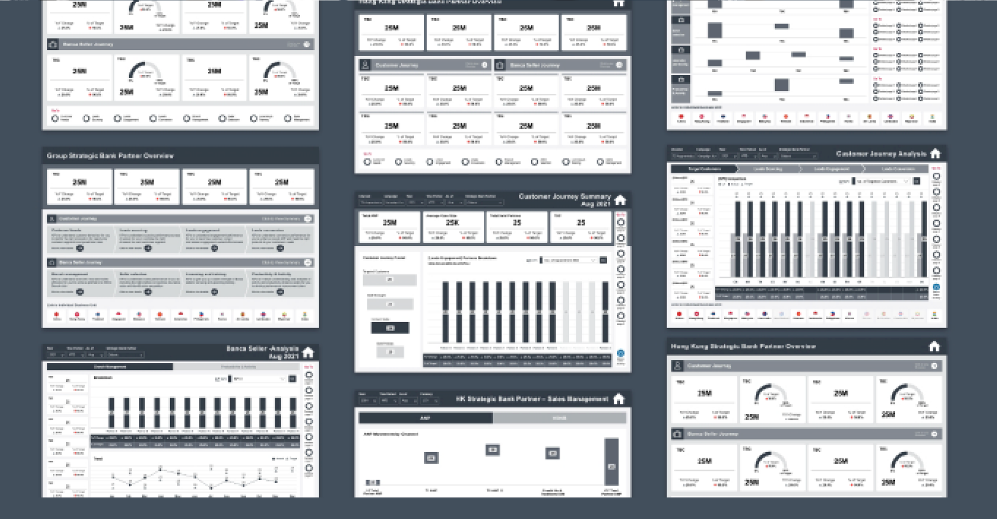
A reusable BI design system, not just four pretty screens.
Co-designed data dimensions, filters and page-level layouts. Generated templates and comparison patterns to be applied across future dashboard development — anchored by a BI style guide aligned to Power BI feasibility and the client's brand.

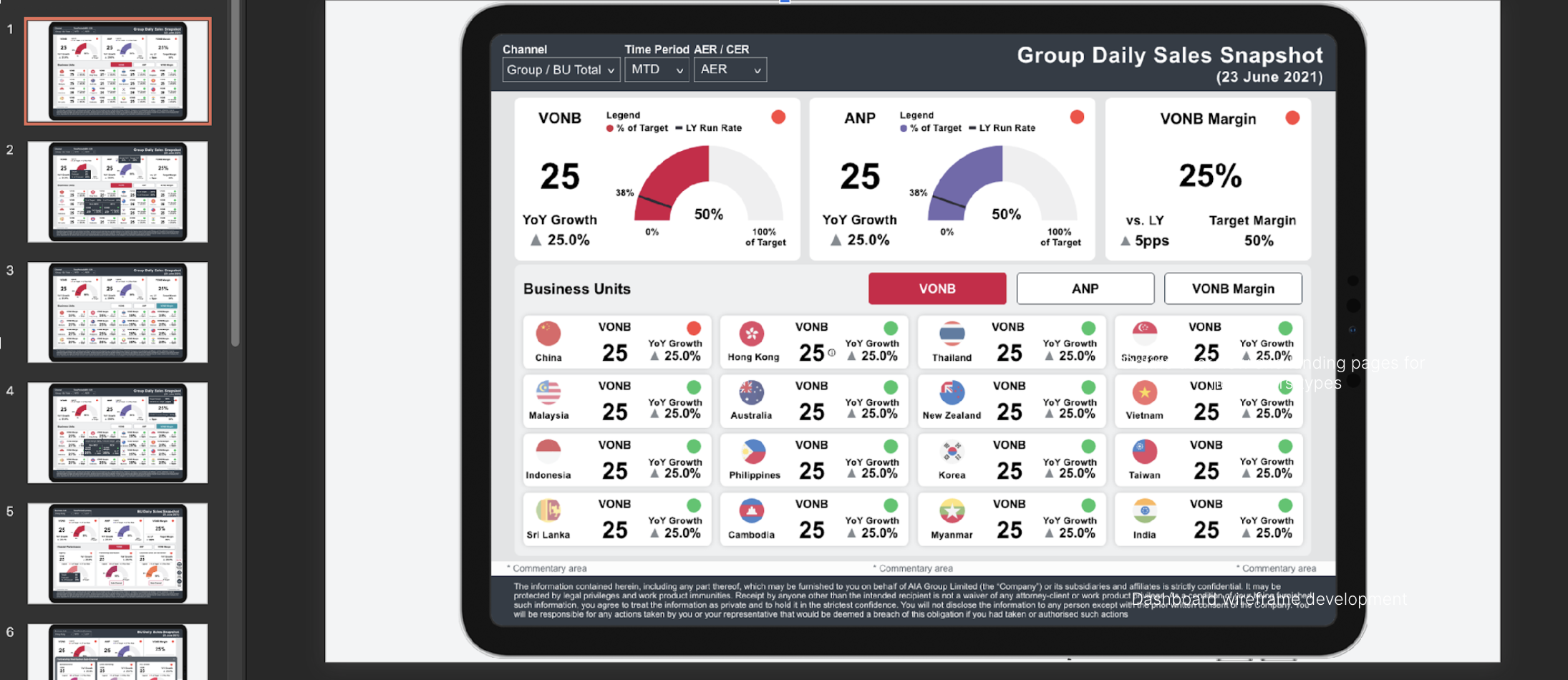
From 2 years to 8 weeks. From 30 seconds to 3.
Report rendering dropped 10× — turning a coffee break into a glance.
New solution built in 8 weeks vs. the original Analytica's 2-year rollout.
A single Operational Data Store significantly reduced support and maintenance cost.
Target architecture portable to the Public Cloud, in line with the group's cloud strategy.

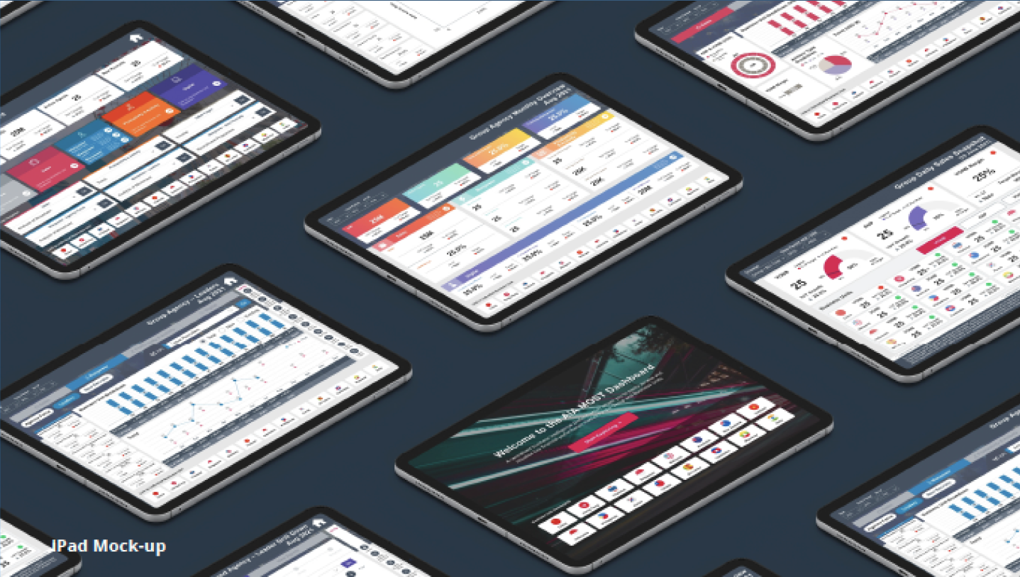
Six people. Two sprints. Four dashboards in production. The MOST MVP became the template for how AIA group finance would ship management reporting from then on — a small team moving fast, with a design system doing the heavy lifting.